


table of contents
- 1. WRITING & DESIGN Inc.
- 2. Neu Co., Ltd. – Bringing dedication and passion to advertising.
- 3. Recruitment Information _ LayerX
- 4. Alche, Inc
- 5. Heart rate (Shinpaku)
- 6. 50th Anniversary | SHIPS Co., Ltd.
- 7. Alceo
- 8. Time Tone for Expo 2025 Osaka evala+ItsukiDoi
- 9. Hatena Bookmark 20th Anniversary
- 10. PARCO 2025 AW
- That's all!
1. WRITING & DESIGN Inc.

This is an amazing website. I'm already amazed that it's all created using WebGL and not just video, but what surprised me even more was the "hidden selfie mode." When you turn this mode on (i.e., turn on the front camera), your silhouette appears in the light streaming in through the window. When you wave, it feels as if "another version of yourself somewhere is waving back at you."
It felt like a scene from a movie, yet at the same time, it gave me the feeling that "I, too, am living in a world as lovely as a movie."It felt as if the site was asking me how I feel about myself, and it evoked a strange sense of nostalgia—a truly moving "experience." The interactivity and the company's philosophy subtly intertwined, and the site conveyed what WRITING & DESIGN values.
Client WRITING & DESIGN WRITING & DESIGN PARTNERS
Creative Direction, Art Direction, Design: Im Jong-ho (mount inc.)@junim Planning, Art Direction, Technical Direction, Development: Kenji Okabe (mount inc.)@kenjiokabe
Design: Thai Towon (mount inc.)@tai_t_
Produced by Ko Yoshida (mount inc.)
Project Management Shoko Nakahashi (mount inc.)
Copywriting: Takuma Takasaki (WRITING & DESIGN)@takumantakuman
Translation by Lilia Silva (Latina Fortis)
Music: Takuji Aoyagi (Little Creatures)
2. Neu Co., Ltd. – Bringing dedication and passion to advertising.
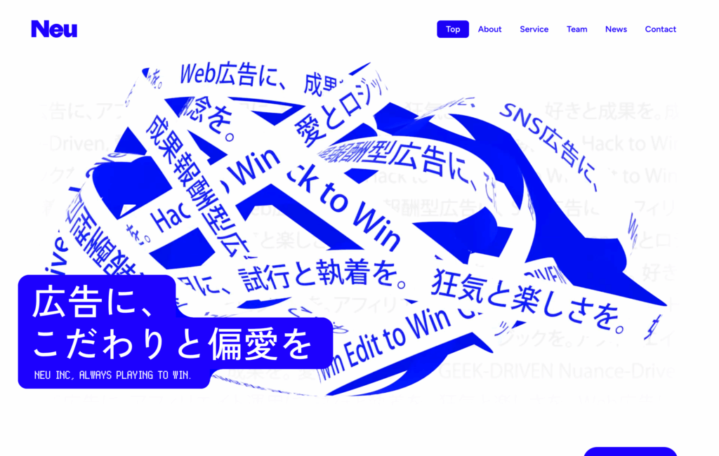
The key visual (KV), which combines words and objects, is intriguing. From this object, to the mouse stalker that displays keywords related to Neu such as love and obsession, and the string of words that appears when you return to the top from another page, it's clear that there's an excessive amount they want to convey (their dedication and passion).
This attention to detail and passion is expressed in the gimmicks throughout the site, from the way the team videos are presented to the occasional tilted dot-matrix conversions, which are all enjoyable. And what's noteworthy about this site is,This is a project where a creator with no coding experience is creating everything using the no-code development tool, Fremer.You should also definitely read the production background post by Junpei Horino, who was in charge of production.
Client Neu Inc.
Creative Direction / Planning / Art Direction OHTA Yoshitaka (FunTech inc.)@yoshi15_funtech
Design / Framer Development HORINO Junpei (FunTech inc.) @jdesign06
Technical Direction HASHIMOTO Takuma (FunTech inc.) @tkm_hmng8
Built with Framer @bsr
3. Recruitment Information _ LayerX
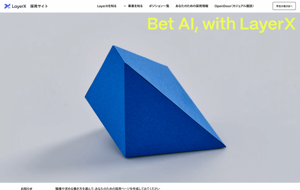
What makes this recruitment site unique is that it creates a "recruitment page just for you." The origami-like objects that illustrate the process of change are also interesting,This object stops moving (generates) the moment it's personalized. It conveys the idea that "there is no such thing as a finished form; it's always a work in progress."
In the case of recruitment websites, the information that job seekers want to see differs depending on their "current situation," and I think they sometimes browse the site in a state between actively and passively. In that respect, this site has a certain aspect that makes you surrender to a kind of passivity. The guiding principles state, "When in doubt, believe in the evolution of AI and choose to bet on AI."It's also interesting how trying out this "customized information" is linked to experiencing the company's guiding principles.
CREDIT WEB DIRECTION : Ryo Yamahira (IN FOCUS)
WEB DESIGN: Tetsuro Shimura @tetsuroshimura
PROGRAMMING : Junya Ohara (IN FOCUS) @jun00break
PRODUCE : Kento Inada (IN FOCUS)
MOVIE DIRECTION: Tetsuro Shimura
CINEMATOGRAPHY: Masaki Ogawa
BOX DESIGN: Maho Motoyama
OFFLINE EDIT: Takuma Miyamoto
CLIENT: LayerX
4. Alche, Inc

It feels like it's been a while since I've seen such a hardcore website. Above all, the logo mark that sits at the center of the MV is striking. The fact that you can adjust the coordinates and texture of the logo shows the company's freedom and entertainment-oriented approach.
With the goal of "creating unprecedented immersive and experiential entertainment," they have indeed built a world that is so captivating you become completely absorbed. In the VISION section, you are immersed in the world within the logo.The logo mark represents the worldview created by ALCHE.This is truly an interactive website. (From WebGL's headquarters)Introduction ArticlePlease do.
Production: JUNNI @junni_jp
5. Heart rate (Shinpaku)
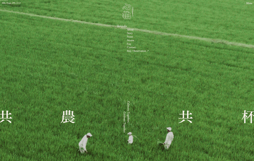
By using vertically oriented photos that don't fit on the screen in the music video, the dynamism of the farmland is conveyed through the scrolling experience. It's a refreshing feeling, like a breeze is blowing. From there, the body copy, words and photos, vertical and horizontal writing, and every single space creates a comfortable rhythm. When you think about it that way, even a "heartbeat" is a rhythm, isn't it?
Writing Japanese vertically creates a tanka-like rhythm, and the vertical scrolling even gives the illusion that it's lightly beginning to sing.
There's a sense of rhythm created by the interaction between the user's action of scrolling and the design, and that feels fresh and innovative.The fact that only the footer is actually a video leaves a beautiful, lingering impression. It was a site that conveyed a sense of exploration into quiet beauty.
Client: Magasin Co., Ltd., Shinpaku-sama
Direction, Writing, Translation: Yu Shigematsu (Shhh Inc.)
Art Direction, Design: Katsuaki Utsunomiya (Shhh Inc.)
Logo Design, Illustration: Keiko Kishimoto (Magasinn, inc.)
Copywriting: Kan Fukazawa
Photography: Ryo Kono (hyogen), Orie Ichihashi, Shotaro Ichihashi, Hiroki Kawada, Kenta Yamaji (shinseki), Tatsuya Iwasaki
Model: Minami Yagi
Development: Kazuma Sakata (Good rings)
6. 50th Anniversary | SHIPS Co., Ltd.
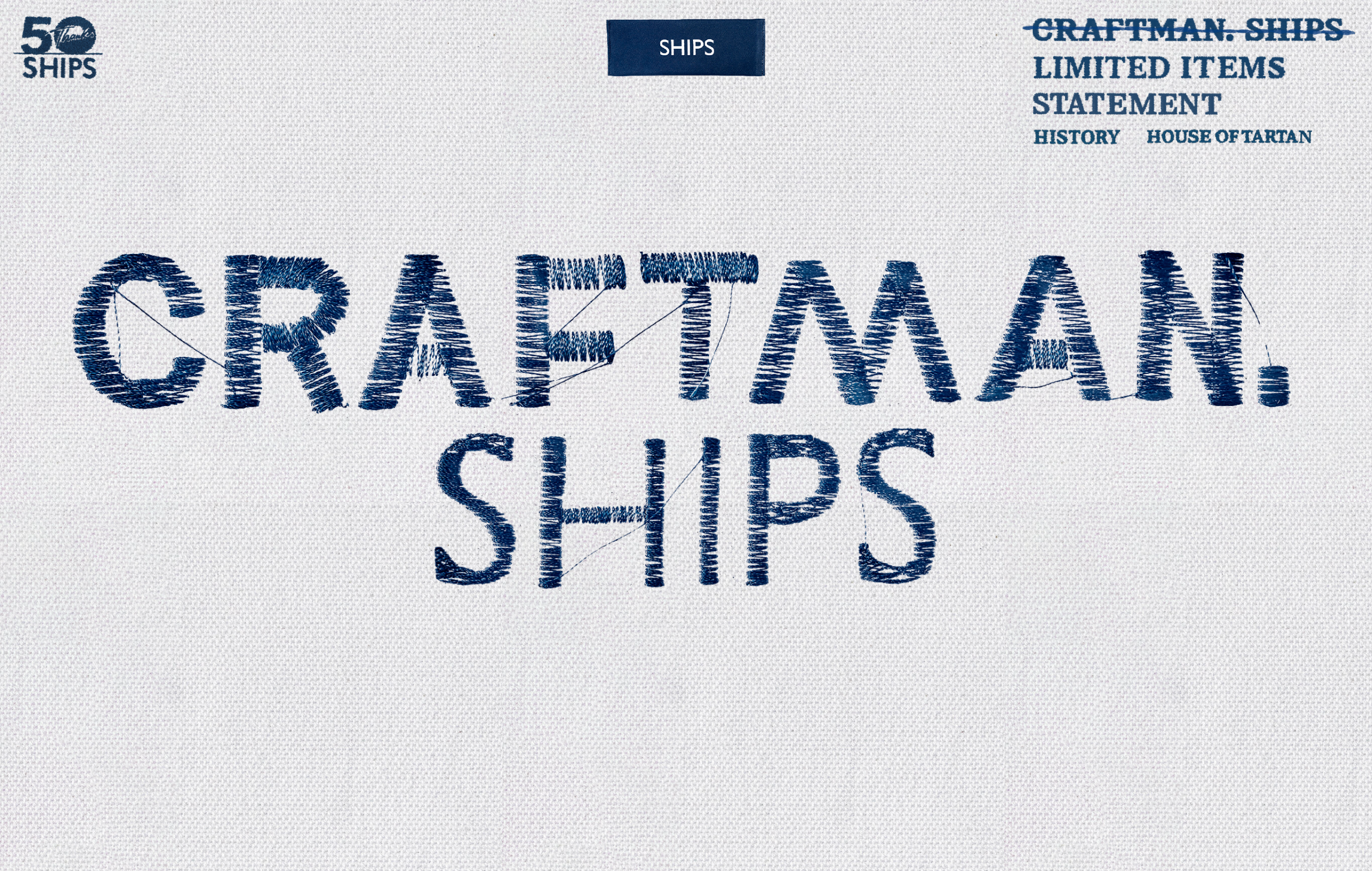
This website is entirely made up of embroidery. First of all, the screen itself is like "fabric," and the change in material feel from the "monitor screen" you were looking at before is drastic. It's like your mood shifts a little at this point. And the realistic depiction of the embroidery running across the fabric is amazing. Even the cross buttons are uniquely designed to look like buttons on clothing.
What's amazing about this site is how the staff's illustrations and compelling copy unfold seamlessly against the backdrop of its embroidery-like design.The overall design and the embroidered elements work together seamlessly.It gives off a "returning to basics" vibe for SHIPS, and I can really connect with the brand. The way they've cleverly combined craftsmanship and SHIPS is brilliant.
Production: STAND FOUNDATION co.,ltd.
Illustration: Shinko Uematsu
7. Alceo

This website's key visual (KV) is a moiré animation. It's innovative because it uses something non-fixed—a constantly moving visual pattern—as the KV, rather than a clearly defined "shape." There's a Stop/Play button, and the KV changes depending on when you stop it. It's interesting how they've made this ambiguity and vagueness a part of their identity. In recent years, variable logos have been gradually increasing, and it's fascinating to see this variability and "movement" aspect emerging in identity. The design is simple yet clear.
Client: Simplex Inc.
Producer: Kazuya Okada
Assistant Producer: Kazuyo Miyagawa
Director, Project Manager: Tetsuya Kobayashi (BACON inc.)
Copy Writer: Seiya Munakata (White Note Inc.)
Art Director, Designer: Ryohey Kamada
Technical Director: Yoki Sakamoto (ARUTEGA Inc.)
Front-end Developer: Wataru Kojima
Photographer: Fuminari Yoshitsugu
8. Time Tone for Expo 2025 Osaka evala+ItsukiDoi

The screen design is intentionally confusing at first glance. As you scroll, you'll find word-processed text reminiscent of old documents handed out at events. It feels less like a design and more like a document. When this is presented alongside an impactful music video, it brings a unique and strangely fresh feel. This site doesn't just pursue novelty; it also incorporates a certain "feel" of old, and I felt that the way it achieved this was excellent.
9. Hatena Bookmark 20th Anniversary
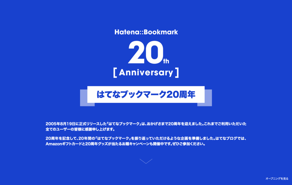
To celebrate its 20th anniversary, Hatena Bookmark has released content that looks back on 20 years of popular Hatena Bookmark posts. Not only are the most popular articles from the past 20 years ranked, but articles that have received many "tags" such as "read later" over the past 20 years are also ranked.
What I felt after looking at this site wasThe fact that "having content" is truly impressive, and the "curation" aspect—how to classify that vast amount of content—is what separates success from failure.That's the gist of it. In short, it's not a business document, but rather a collection of interesting articles with no particular focus. It's a site I'd like to enjoy when I have some free time; it actually seems like it could last surprisingly long.
10. PARCO 2025 AW
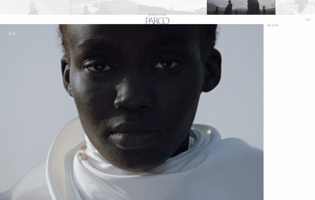
The screen remains fixed while a movie plays, and each time you click, photos and videos are superimposed on the screen (the top of the screen shows a list of photos).The menu button actually contains various content such as the concept statement, movie, director's message and profile, and credits, while excluding everything except what they most want to showcase.
Furthermore, according to the creator, eieio, "The visuals in the background subtly incorporate weather-linked effects based on weather data from Oshima, Tokyo, where the key visual was shot. The white dots that appear according to the amount of rain appear and disappear like drops of memory, and the lines that correspond to the wind speed appear and disappear like wind trails." (quoted from Instagram) It's interesting how the site's appearance subtly changes based on weather data.
Creative Director: Aj Duan
Director: Aj Duan
Director of Photography: Bowie
1st AC: Fang Xiaohe sdodo studio
2nd AC: Cai Mengjie sdodo studio
Camera Assistant: Zhang Juntao MD vision
Equipment: sdodo studio & MD vision
Editor: Teng
Color Grading: Shi Wenlong, Sharon WASH
Sound Design: IXYXI studio, Teng
Photographer: Effy Yu
1st AC (Photo): Yang Hao
Producer (Shanghai): Tiantian
Special Thanks: Tinseoi
Voice Over (Male): Henry Jen
Creative Director: Shinichi Yamashita (kokoroni)
Design: kokoroni
Producer: Masaru Kaku (kirameki)
Production Manager: Nao Inoue
Model: MUOY
Model: CHIYO
Casting: GOLD CAST
Stylist: Shotaro Yamaguchi
Hair & Make-up: Namiko Takemiya
Lighting Director: Jialin Ren
Drone Operator: Keiichi Kitamura
Postproduction: Omnibus Japan
Editor: Hiroshi Matsuda
MA Mixer: Teppei Ohni
DPE: IMAGICA
Web Design: Ryota Ebina (eieio)
Web Development: Yusuke Fukunaga
That's all!
How did you like our summary site for August 2025? It was fun again this time, wasn't it?
To pick out a few from this site,
- An attempt to combine interactivity with the company's philosophy by placing oneself, representing "WRITING & DESIGN Inc.," into a world like a scene from a movie.
・"Neu" was entirely created using Fremer by a creator with no coding experience.
- The spirit of trying out "customized information" = "LayerX" allowed me to relive this company's guiding principle.
- The reciprocal rhythm created by the user's scrolling behavior and the design of the "heart rate" feature.
- "Alceo"'s identity is its continuously moving visual patterns.
That part left a lasting impression on me.
Thank you for reading to the end this time as well!
See you again next month. Have a great end to summer.
This was the iDID Media editorial team!


