

table of contents
1. Japan Design Center

The screen, predominantly white, displays the words "Maybe it's like this." The "unclear uncertainty" of these words is then answered by the corresponding "headline copy for each achievement." This clever use of the viewer's psychology is brilliant.
Furthermore, the site's upper section represents "future plans" and the lower section represents "past achievements," creating an intuitive structure that flows from "future ↔︎ present ↔︎ past" rather than "top to bottom," which is quite innovative. The overall design, which leaves room for user initiative, is excellent. It's clear that having independent projects in addition to client work allows a company's values to be conveyed not just through words, but through the "practical application of its stance."
Produced by: Japan Design Center
2. Performing Arts Festival "Autumn Meteorite 2025 Tokyo"

The screen is filled with something mysterious, like a flash of light. Looking closer, you can see the word "meteorite." It turns out this is a "VI." Here, "meteorite" means "something very different from what we are familiar with," and it is "not a fixed graphic with one form, but a generator that allows anyone experiencing the visual to arbitrarily change its shape ," so the output design will never be the same twice. It is a variable VI. On a PC, the visual changes based on mouse detection, and on a smartphone, it changes based on the gyroscope function detecting the tilt. As this is a teaser site, I'm looking forward to seeing how this VI changes on the main site.
Creative Direction: NEW Creator Club
3. nosson

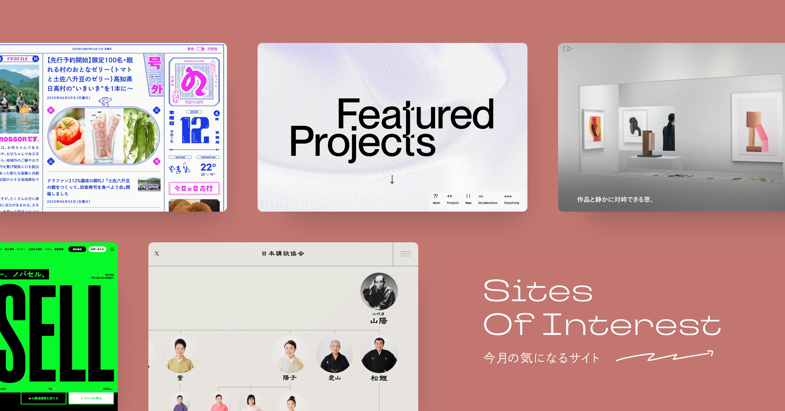
Surprisingly, it's designed to resemble a newspaper (a local community bulletin board). Newspapers are filled with a jumble of information, but perhaps because this layout has survived throughout the long history of newspapers, it's surprisingly easy to read.Its newspaper-like design brings a "new level of readability" to the web.That said, it is the web after all. Articles have links you can jump to, and the illustrations move, so this is truly "Hyper Newspaper 2.0" (that description is way too old). They also have a strong business philosophy: "The village where grandmothers are the happiest in Japan."
Recently, there's been a movement to incorporate graphic design, visibility, and readability into web design, and I think this is starting to gain traction among the countless websites out there. This trend is definitely one to keep an eye on.
Production: STAND FOUNDATION co.,ltd.
4. Mikura Island

"This is Tokyo, where only 300 people can live."...It's rare to find a tagline that sounds so fresh. The combination of "Tokyo" and "island" reverses our image of Tokyo. The scenery in the music video reinforces this. Also, the continuous video and the sequence of images with different cuts create the vibrancy and atmosphere of Mikura Island, and not only the photos themselves, but also their placement and presentation bring out the emotion and vitality of the photos even more. The same is true for the randomly displayed photos in the footer, and the lingering impression here is captivating. And the flow of the next action is also well-placed here. Hmm, they're definitely doing this on purpose.
Client: Mikurasima
Agency & Production: PARADOX Corporation. STARRYWORKS inc.
Direction, Copywriting: Ryohei Toragami (PARADOX Corporation.)
Copywriting: Junpei Shimada (PARADOX Corporation.)
Creative Direction, Design:Koji Kimura
Planning, Direction:Shinji Sato
Design: Laura Thonne
Programming: Katsuya Murano (K28)
Movie Director: Kosuke Nakaya (DRAWING AND MANUAL)
Cinematographer: Takumi Gunji (DRAWING AND MANUAL)
Photography: Ryota Sakai (Partner)
Photography:Takuya Otaki (Partner)
5. UNIEL ltd.

UNIEL's corporate website, with its impressive illustrated motions, is now in its tenth year of operation. While the recent redesign includes a reorganization of their philosophy and business, what particularly stood out to me were the About UNIEL section, "We value sharing and deeply understanding the values and ideas of those we work with," and the Etos section, "Creating genuine connections." This demonstrates their emphasis not only on creating products but also on building connections.
This is also true of this latest redesign, where the site is being built in collaboration with creators who understand UNIEL. It's clear that "connection" and "craftsmanship" are seamlessly integrated in the production process. I felt that the site truly expresses UNIEL's unique identity.
Illustration motion:With
Frontend/Backend: Sora Shimada @sora1406
Photography and videography:Komatsu Kohei
Music production: Nagao
Narration:We
6. Featured Projects

The design project "Featured Projects," which operates under the concept of "Good craftsmanship opens up the future," has incorporated (congratulations!). The sparkling mark-based design behind Featured Projects evokes a sense of unknown possibilities and excitement, which is very pleasant. The expression from the music video to the lead copy is also interesting. The words "Featured Projects" appear directly at the beginning of the lead copy, and there are several annotations within the lead copy. The collaborator page is also interesting, with everyone hidden behind a glass mosaic. The icons on the global navigation are also like this, and by not being fixed to existing information such as icons and faces, I felt a sense of determination to open up unknown possibilities.
Production: Mugi ⌇Baku @_baku89
7. Japan Storytelling Association Official Website

First of all, the impact of this family tree of storytellers is outstanding, isn't it? Because storytelling and rakugo have a long history, it can be difficult to know where to start. It's like in dramas and novels, when you want a relationship chart of the characters. The Japan Storytelling Association's website displays a "family tree" at the top, making it easy to get an overview of the entire structure and organization of storytellers in the Japan Storytelling Association. You can even feel the history that storytellers have gone through. For example, I only know Kanda Hakuzan, but I can see where Hakuzan is in this family tree and what his position is. Not only is it a great introduction to understanding, but it's also a good site because it gives you a glimpse into "what a storyteller is."
8. NOVASELL

The message, "Especially in the age of AI, let's cherish personal touches," resonates with the idea of refreshing the value of "personal touches," which are often seen as a disadvantage, in the age of AI. What's also noteworthy is the provision of multiple "concrete contact options," such as "Receive the fastest AI proposal" and "Invite us to the competition," and concrete contact options make you want to click.
9. A DAY OF PHAETON 2010 – 2024

The website features 60 shots (60 minutes) of footage taken with a fixed camera inside and around the select shop PHAETON, which plays repeatedly 24 times a day. What's more, you can't fast-forward or fast-back. It's a pretty unconventional site, but the request was to "preserve, in some form, the place, building, and atmosphere that have existed for the past 14 years." Indeed, even words and site explanations have been boldly cut out, leaving the atmosphere of the place just as it is, neither too strong nor too weak. It's similar to the feeling of watching nature footage shot with a fixed camera. It's a site that will evoke a strong sense of attachment in those who loved the store, and the impression it leaves will vary greatly depending on the viewer. It's a very experimental endeavor.
Creative Director: suzkikenta
Director and Camera: Yusuke Ishida
Camera: Yuma Maehara
Music: Riki Hidaka
MA: Wataru Toda
Producer: Shiwo Futai
10. Feel Free to Customize

Recent mobile-first websites are really interesting, and the key is how to utilize the blank space on the left and right sides of the PC screen. This "FEEL FREE TO CUSTOMIZE" site has an exciting feature where you can play videos on the right side and move characters on the left side. Also, by dividing the content in this way, the links (videos in this case) really stand out. The way you can cleverly divide and handle "content" between the main area and the left and right areas shows that there is still a lot of potential in this mobile-first approach. I'd like to introduce this in more detail sometime.
It's finished! 👀
How did you like our summary site for July 2025?
This time, I was impressed by several things: the new perspective of "Japan Design Center"—not "top to bottom," but "future ↔︎ present ↔︎ past"; the new readability achieved through the newspaper-like design of "nosson"; the expression of "Featured Projects" that is not fixed to existing information; the overall overview and history provided by the genealogy of the "Japan Storytelling Association"; and the content division in "FEEL FREE TO CUSTOMIZE" with SP first. What did you all think?
Now, regarding iDID Magazine, we've heard rumors that it's undergoing a minor redesign in July...? We hope you'll look forward to finding out what happens after July.
Thank you for reading to the end this time as well!
See you again next month.
This was the iDID Magazine editorial team!


