

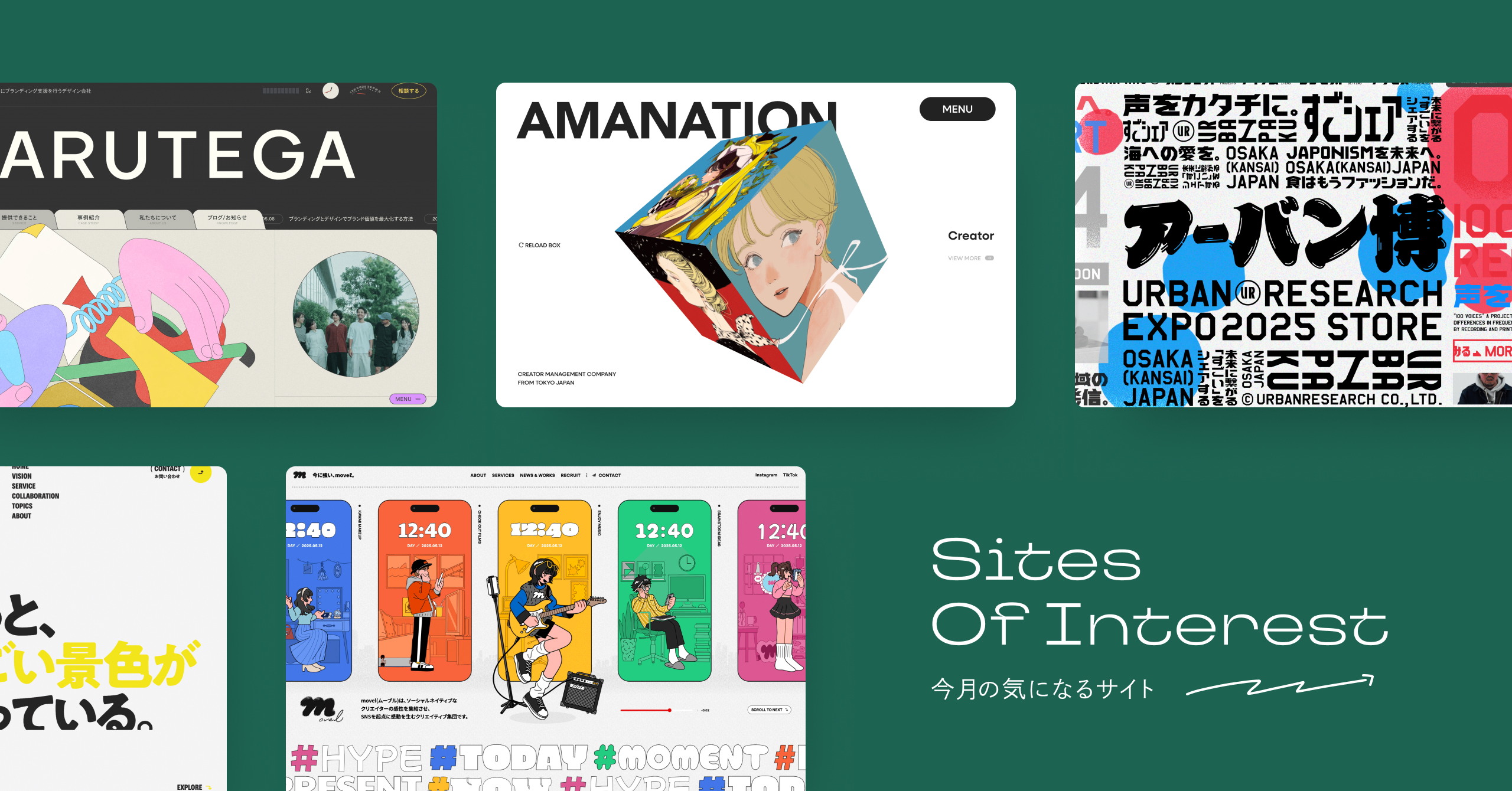

table of contents
1. ARUTEGA
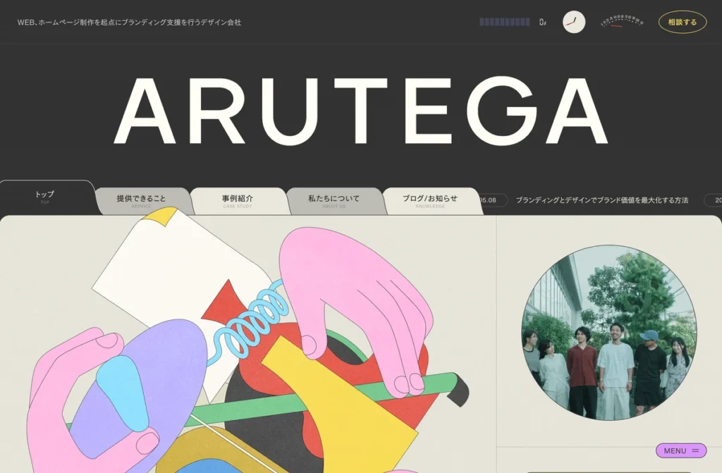
Ayumi TakahashiARUTEGA's corporate website features incredibly impactful illustrations by [artist's name].The use of color, including this illustration, in a sense determines the impression of the site, and represents the "support for unadulterated expression" that is also mentioned in WHAT WE DO.Furthermore, the car instrument panel-style function in the header, the tabbed menu, and the news that disappears behind the tabs are all interesting little gimmicks! The idea of having partners write comments in PARTNER'S VOICE, and the involvement of Eat, Play, Sleep inc. in creative direction, design, and editing, are all directly connected to ARUTEGA's WHAT WE DO.
Regarding the wording, phrases like "Don't give up" in "WHAT WE DO" and "PROMISE," mentioned earlier, are not overly focused on the strength of the copy, but rather use tangible language, which is also a form of "pure expression." ARUTEGA's intentions came across very clearly.
Creative Direction, Editorial / Daiki Tsutsumi (Eat, Play, Sleep inc.) @ittan_momeo
Art Direction, Design / Yohei Yamamoto (Eat, Play, Sleep inc.) @yohewitter
Develop / Harukichi(ARUTEGA Inc.) @fuwafuwahappy
Photo, Eye Catch / Toji(ARUTEGA Inc.) @t_ji09
Support / Yoki Sakamoto @sakamoti3web kinomi @kinomi_design Norio Ozaki (ARUTEGA Inc.)
Key Visual / Ayumi Takahashi
Project Owner / Makoto Hirao
Special Thanks Message
@otsuki_chihiro
@webkirin
@tomonorix0805
@bacon_kobayashi
Yuma Shibasaka
2. AMANATION

Stans is in charge of the website redesign for "AMANATION," an illustrator management company. The first thing that catches your eye is this "multifaceted 3D cube"! What's amazing about this cube is how "expression" and "functionality" are integrated. When you click on a face, the polyhedron changes from "3D to 2D" and displays a single creator, from which you can transition to the creator's details. It's outstanding. There's also a reload function, which will likely make it even more interesting as the number of creators increases! As it's a site mainly focused on illustrations, they could have gone in a more flamboyant direction by using illustrations more extensively, but that could also mean being too dependent on the illustrations. To establish the brand, they tightened things up with the cube and the overall design in a stylish way. I was also impressed by the sense of dignity that the company conveys.
Oh yeah, you can listen to the behind-the-scenes story on Stance Radio below. Please check it out!
Client: AMANATION Inc.
Creative Director / Designer: Hokuto Chihara @hktchr_
Lead Developer: Yusuke Hayamizu aka PEKO @pekopekoonaka_
WebGL Developer: Souichiro Yamamura @soh__y
by @stans_jp
3. movel Inc.

MEFILAS is in charge of the corporate website for movel, a company that creates movements in the times with creative content starting from social media. The first visual ( FV) which features a series of smartphone screens is already full of ideas. This FV makes it clear to some extent that the company's business is related to smartphones and social media, and that each person is doing something "emotionally moving" at the same time.
What's interesting is that the illustrations change depending on the time of day, giving a sense of reality to move's theme of "people living in the present." Illustrator meru 's illustrations are also cute. The overall design is based on the casing of a smartphone, and the balance between pop and solidity is excellent, from the introduction of move in the style of an SNS profile to the use of hashtags.
Client: movel Co., Ltd.
Direction, Planning, Project Management, Creative Direction: Dai Harada (MEFILAS)
Art Direction, Design: Yosuke Kamisugi (MEFILAS)
Technical Direction, Programming: Shingo Tajima (LuckyBrothers&co.)
Illustration: meru
Art Production: ROUNDHOUSE
4. GLOBAL TREE

This image and copy, which resemble a lingering afterimage, didn't make you think, "Huh?!" But this "slight sense of unease" is what brings a fresh feel to the site. The body copy also consists of long, continuous sentences without line breaks, which might seem difficult to read at first glance, but this is a brilliant hook. It's designed to take advantage of the human tendency to read even if it's a little difficult to read.
The continuity of the photos and copy conveys a "reflection of a desire to keep moving forward without being fixed," while the long, unbroken copy conveys a "passionate intensity." The balance between this "unusualness" and "passion" is outstanding. I thought, "So this is another way to communicate!" The attention to detail in the presentation, such as the hover actions and the color changes of the scrollbar and three-dot menu, made me think, "Design is so interesting!" It was a website that made me think that. I really liked this design...I wondered who designed it...and it turned out to be by Utsunomiya-san of Shhh!
Client: Happy Life Care Inc.
Account Manager: Takuma Kato@addsugar_takuma Kazuya Okada @okadadada4
Producer: Iku Ando
Planners: John Nishiyama, Shoko Imaizumi
Art Director: Hiroki Miyamoto
Technical Director: Hiroaki Yastomo @kaminaly
Front-end Developer: Takaaki Sato, Sayaka Kiyose, Anna Komakine
Designer: Katsuaki Utsunomiya (Shhh inc.) @kUtsunomiya
Project Manager: Nakamizu Toshihisa
5. Kaito Note

This is the portfolio site of motion designer and web developer Kaito Noda. The design is beautiful, featuring a collection of circles representing "four domains" based on a Venn diagram, and a grid-based design. It's a conceptual site, reflecting his goal of "pursuing experiences that evoke a powerful, almost fiery, impact in the heart."
What I found unique was the transition messages. Messages like "Good Job Is Danger," "Play Football," "Nervousness," and "Blood Type Is A" give you a glimpse into your own personality.They've brilliantly utilized the "transition" feature, which is designed to catch the eye for just a moment. The same can be said for the mouse stalker, which plays a role in supplementing and explaining the linked page. I can sense Mr. Noshita's approach to production in how he has incorporated his own unique ideas into each function.
By the way, I should mention here that Mr. Noshita is also involved in the creation of the VANSCH website, Shiraishi Clothing Store website, and reynato.tokyo website, which have all been featured in iDID Magazine before, so I thought, "Oh, he's the one who made those websites!"
Direction/Development: Kaito Note
Design: VANSCH@VANSCH_)
6. Lilas Ikuta meets COACH

Following "LQVE" and "Shogo Tominaga Portfolio," which we introduced in last month's issue, this is another site created by Nakano-san and Keita Yamada-san working together. As I always feel, Nakano-san's designs have hooks throughout that guide the user through to the next content, and that seamlessness is very satisfying. For example, the four thumbnail videos in "Play Movie" come together as one, and that hook starts the interview content, and in the interview content which is based on cards, there is a flow from "headline" → "photo" (this is the hook) → "body text," and there is a sense of rhythm and pacing in everything. Ah, maybe this is also a DJ-like sensibility.
The "Back to top" feature, which loops the thumbnail video at the bottom of the page directly into the music video, was a refreshing surprise. I was impressed to see creators sighing (in a good way) on social media after seeing the site.
Here's an interview article featuring Nakano's memorable statement that "DJing is at the root of design"! 👇
Model: Lilas Ikuta
Movie director: Akari Eda
Cinematographer: Nao Saito
Gaffer: Hajime Ogura
Colorist: Sakito Nadoyama
Music: Masaya Tamura
Photography: Shota KONO
Style direction: Keita Sasaki
Styling: O Suganuma
Hair & Make-up: YOUCA
interview & text: Yamato Yoshikatsu
Edited by: Daisuke Yokota, Honami Wachi
Web design: Hiroaki Nakano
web front-end development: Keita Yamada
7. seee

In the bottom right corner of the screen, there's an "eye" icon. You might wonder what it is, but each time this eye blinks, the WORKS menu changes. When you click this icon, the screen goes completely dark, and the word "seee" changes to "zzzz." There, you see cats, countless eyes, moving hands... Ah, it's a dream!
This "blinking" motion also appears when you hover over WORKS images, and the word "seee" drops to the bottom of the screen when you move to various pages, so you find yourself following various movements with your eyes. You start to wonder why these actions are happening... and you begin to become meta-conscious of the act of "seeing."
The company name "seee" itself is said to represent a stance of trying to interpret the act of "seeing" more deeply, and the company's stance is made to be apparent not through words, but through the "actions" of the users. This is what makes this site outstanding.
seee inc.: @ kobayashi187
Design: @tetsuroshimura
Motion: @takehitogoto
Develop: @ishiyamayama_
Cat: yo con
8. DATUM STUDIO Inc. | Mid-Career Recruitment Site

The keyword here is "data utilization," and I find the crashed data effect that appears in the bottom right of this FV interesting! What's more, it's not just a subtle touch, but used boldly. I'm really curious about the background here. The periodically appearing square motion is also interesting; these seemingly meaningless expressions act as a hook and express the company's unique character. I also like the originality of how the Magazine and Work Style sections are presented at the top.
Produced by: GEKI
AD + D ARKREIS (@4rkreis)
9. Nishitani Design

It's amusing that the loading screen displays the words "Loading diligently" along with a rough design. The loading screen truly represents "preparation," and I like the contrast between preparation → rough design and preparation complete → final version. The latest news is that "his son got a perfect score on a cram school test," and there's also a photo gallery section of his son, TAO, which shows he's a doting father (lol). He says to feel free to ask for advice even if it's just for advice, and I almost asked for advice myself, but then I stopped myself! Personal websites and portfolios are personal, so you can see the person's perspective and outlook on life, and I think that's what attracts people. By the way, it seems that cats' eyes follow mice because "cats like mice."
Produced by: Nishitani Design
10. UM English Lab.

This is the website for "UM English Lab.," a platform that provides free supplementary teaching materials using songs by Western music artists to English teachers nationwide. Universal Music's objective is to "socially enhance the value of Western music in the Japanese market," and I think this is a very meaningful initiative in terms of both "learning English using Western music" and "enhancing the value of Western music." The "Keyword" prominently featured in the first video is catchy, and I thought it was interesting that you can get a glimpse of what the site is about from the keyword. There are also creative ideas in how the hover action is implemented. The article content itself is also interesting!
Art Direction: eieio
Design: Supplement
Frontend / CMS Development: Daichi Ooba
11. URBANPAKU (Urban Expo)

The screen is filled with text, photos, and thumbnails, as if to say, "Enjoy the world view more than the content!" Just looking at the graphics is fun!!What's interesting about this site is that as you browse, a jumble of information gradually catches your eye.It starts off by creating an impact with its graphical design rather than focusing on the information itself, and then the information gradually becomes clear as the user becomes engrossed in it... It's a site that truly anticipates the user's behavior.
When you play music, the blue and red elements in the background start moving in time with the sound, and as you browse the site while music is playing, you get a sense of rhythm throughout the entire site, which is interesting as it makes you think about the relationship between "music" and "information."
Production: STAND FOUNDATION co.,ltd.
12. Shibuviewer

Last but not least, we have "Shibuviewer," a project that preserves the ever-changing Shibuya district through 30 viewpoints. The project is being produced by nine new graduates from Puzzle, a company that values the development of creative talent.
What makes this project interesting is that "in Shibuya, everyday life becomes content." And instead of designing or summarizing it, it expresses this by simply "preserving the scenery of the place."
For those familiar with a town, the changes it undergoes are both exciting and poignant, evoking nostalgia for the disappearing landscapes. The idea lies in drawing out these feelings, which people likely already possess, simply by "showing the development process." This site isn't finished once it's launched; it will continue to accumulate content, so there's much to look forward to.
The behind-the-scenes stories of this project are also fascinating. Since it was created relatively from scratch by a group of recent graduates, they had to figure out things like "clarifying roles," "establishing a shared understanding," and understanding each person's strengths and differences in their personalities as the project progressed. It seems that Puzzle values "first thinking about the methodology themselves and discovering it themselves." That was one of my discoveries.
https://note.com/puzzle_inc/n/n9be7f76cf961
Production: puzzle
<New Employees in 2024>
PM: Yoshito Daito, Ryuhei Kawamoto, Moe Kodama, Ayano Fukuda, Ryuga Fukuchi
Designers: Sun Yulin, Toyoshima Megumi, Hori Wakana
Engineer: Xiaojie Peng
<Supporters of Realization>
Creative Director: Yusuke Takai
Art Director: Hazuki Nakamura
Technical Director: Ryusei Nagado (BASSDRUM)
PM: Kazusa Matsumoto, Tetsuya Mashita
Designer: Takanori Furuta
Engineer: Yuhito Takebuchi, Kyota Haruyama
Music: Isao Yamazaki (PINTON)
Editing (Project Movie): Miho Sato (Dadabi)
PR: Kotoe Seino
PR Advisor: Yohei Nemoto (Me inc.)
That's all!
Thank you for reading to the end this time as well!
How did you like our summary site for July 2025?
What left the biggest impression on me this month was
- A tangible way of communicating, including the "unadulterated expression" of "ARUTEGA".
- The integration of "expression" and "functionality" in "AMANATION".
- The balance between "discomfort" and "passion" in "GLOBAL TREE" and "DATUM STUDIO".
- A methodology for promoting the concept through the actions of "seee" users.
- The "URBANPAKU" graphics are designed to guide the viewer's eye from the graphics to the information.
- The "Shibuviewer" methodology of leaving things to the user by "showing things as they are" without giving them a physical form.
That's it. All the sites were great, but there are many other amazing sites that I didn't select this time...that's always the hard part. I'd like to introduce those sites on X as well. Please let me know what you think!
See you again next month.
This was the iDID Magazine editorial team!


