

table of contents
1. LQVE

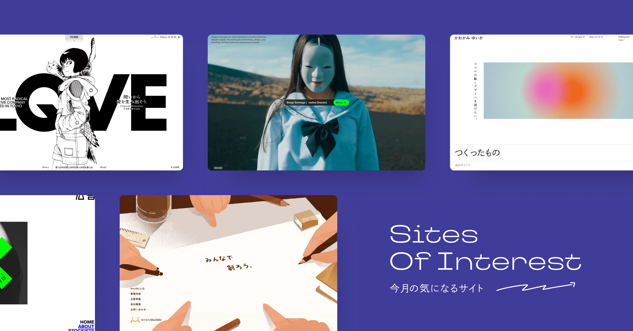
LQVE's corporate website features the striking tagline, "Let's create love from questions." The vivid red that freely moves through the monochrome tranquility is particularly striking, as if contrasting "questions (intellect)" with "love (passion)."
More than anything,The core of this site is the audio waveforms that appear from the footer, synchronized with music such as the "LQVE Company Song." It's as if the entire site has become a music player.
Considering that, all the red motions that appear in ABOUT are also musical design elements.This site offers a DJ mix-like experience, where the "music player" and "website" are inextricably linked.
In fact, we also interviewed Mr. Nakano, who was in charge of creating the LQVE website, and he said that he had a hard time translating LQVE's groundbreaking and irrational nature into the site, and that in the end, he felt like he was creating "music" in a sense. We will be uploading this interview with Mr. Nakano to iDID Magazine soon, so please look forward to it!
Creative Director: Shogo Tominaga @shogo_tominaga(LQVE)
Web Designer: Hiroaki Nakano @HiroakiNakano
Web Front-End Developer: Keita Yamada @P5_keita
2. Shogo Tominaga

Following LQVE, this portfolio site for Shogo Tominaga was created by the Nakano-san + Keita Yamada-san team.
While LQVE was characterized by its distinctive wave-shaped footer, this site is distinguished by its header that sits prominently in the center of the screen. When you open the menu, the content is displayed in a way that resembles a smartphone screen, allowing you to enjoy a unique browsing experience where you view the content on top of a background video as if you were viewing it on a smartphone screen.
And this header changes into a functional header when you look at the Works details. The way the Works section scrolls endlessly horizontally is also interesting.
Like the emuni website, this site redefines the very structure of a portfolio site. According to Nakano, it was the complete opposite of LQVE, which was created after much deliberation, and he was able to create this one smoothly without any hesitation (you can read more about this in the interview!).
Web Designer: Hiroaki Nakano @HiroakiNakano
Web Front-End Developer: Keita Yamada @P5_keita
3. ``Advertisement'' CASE #01 Legalization of territory invasion.

The magazine "Advertising" has been revamped. With three different cover designs and Rie Kudan's "95% AI Novel," we're already incredibly excited, but the website is equally impressive in its quality.
The site appeared as if it had been taken over by something, which is truly a "territorial infringement."It prioritizes "experiential value as an advertisement" over "information acquisition."
It's as if they're saying that infringement equals illegality, and that right or wrong is irrelevant; new forms of expression lie beyond that.
To infringe upon something means to challenge something new even if it is rejected. In that sense,Despite being sensational, I thought it was a legitimate website that stayed true to its purpose.
Another thing I found interesting was that even though the text was difficult to read, the meaning somehow got across. This reminded me of the phenomenon where you can rearrange the letters in a sentence and still be able to read it, and it made me realize that the discovery that "difficult to read" can actually be "surprisingly readable" comes from challenging the difficulty of reading.
Producer / Planner: Yusuke Yamanaka (Yone Co., Ltd.)@komeusk
Project Manager: Shun Shinohara (Yone Co., Ltd.)@shunshinohara
Art Director / Designer: Hidetoshi Hara (Sunny Inc. / Nauts™)@suuuunnnnnnny Developer: Ryo Ikeda (devdev Inc. / Nauts™)@ikeryou
4. Recruitment Information | Beige Co., Ltd.

When you hear the term "recruitment site," you probably imagine something with employee photos, copy, interviews, and so on. But when you look at Bayge's recruitment site, it really changes that kind of "image" of what a recruitment site should be.
- In the FV (First Visual), show about three lines describing Beige's characteristics, plus the job openings.
Each menu item is simply labeled "Company," "Work," "Employee," or "Workplace," without any embellishments.
- Each list page has a simple title and no thumbnails.
- The interview details page consists of bullet points, except for the headings. There are no photos.
In short, it's designed to strip away all unnecessary elements, conveying only the essentials in a minimal way.
On the other hand, there are unique features and content that are characteristic of Bayge, such as "Bayge in One Page," "Display of Pages Users Recently Viewed," "Voices of Other Employees," and "Article Reading Time." It's interesting how their focus on simply conveying what needs to be communicated has resulted in features and content that can't be found on other recruitment sites.
This website reminded me once again that when conveying content, it's important to communicate simply, without unnecessary embellishments, focusing only on the essential elements. The fact that the site name is "Recruitment Information" and not "Recruitment Site" says it all. The fact that it was produced by Studio is also a key point!
Production: baigie inc.
5. Nariaki Obukuro

Musician Narifumi Kobukuro has announced his candidacy for the Saitama mayoral election, scheduled for May 25th. His website has also been launched (the public posts on the site itself have gone viral).
I looked up the websites of the candidates in this mayoral election,Of the eight candidates, only Mr. Kobukuro and Mr. Sawada have websites, excluding the current mayor, Hayato Shimizu.The three individuals whose names I mentioned also have YouTube channels. It seems that more and more candidates are publishing their manifestos on websites as they run for election.
Kobukuro-san's website isI was surprised at how well-organized and easy to understand the content is, especially since it's optimized for smartphones, with slogans, visions and policies, and roadmaps all neatly presented. Because the content is so well-organized, Mr. Kobukuro's manifesto and message are easy to grasp and understand.As someone involved in the digital world, I will be observing the situation closely, including the outcome of the digital PR efforts for this mayoral election.
Ryo Nakae @ryo_dg
6. DAY LOOG

This is the personal blog site of front-end engineer Tomoya Okada.Its distinctive feature is that it's a visually appealing website that utilizes various technologies such as Three.js and GSAP, based on a microCMS.
Furthermore, the content honestly describes Okada's daily challenges, achievements, and anxieties as a front-end engineer, and it's great that you can get to know Okada through his portfolio, blog, and social media accounts, including his posts about animation.
Produced by: Tomoya Okada @__o_state
7. VECTIV

At first glance, I thought, "This is a cool site." The jagged look of the images, the typewriting-like style of the text that makes it seem like it's running, the gadget-like features, the gallery that even displays file sizes, the sitemap-like presentation of the menu, the tree structure of the interviews... I could feel the enthusiasm to take on new challenges in design. Someone from Shed Inc., who was involved in the production, said that they "liked the UI design that reminded them of GitHub," and indeed, I don't know the details without asking, but it made me realize that designing a site with an image like GitHub in mind can make it so interesting. Come to think of it, there was also a comment that Bayge's recruitment site was Notion-like.
Production: Shed Inc.
8. Magazine Layout

NEWTOWN created this website for Morisawa's web seminar, and according to Inukai, "It was created using magazines as a design source and multiple web fonts that serve as a typeface sample book."The concept was "magazine design techniques that can be used on the web," and they were thinking about trying to incorporate the thinking behind magazines into the web.That's interesting!
The site introduces several fonts, along with tips and practical examples of how to use them, while also discussing font trends from the 2000s onward.The meta-references to other sites within this site are typical of NEWTOWN and quite amusing.Learning about fonts from scratch can be overwhelming, but this site teaches you from such a specific point that it makes you want to learn more about fonts in a fun way. NEWTOWN, please make time to create things like this regularly!
Production: Takashi Inukai (NEWTOWN)
9. Kawakami Yuika

This is Yuika Kawakami's portfolio website. Ms. Kawakami views her portfolio website not as a "success story" but as "herself," and when you look at it with that in mind, it's interesting how the site starts to seem like a person. (As of March 23rd, when the site was launched) she is currently looking for a new job, but a portfolio is a virtual version of oneself, and recruiters are surely looking at the person, not just the work. Considering that, viewing a portfolio website as oneself is a very essential thing, isn't it?
Produced by: Kawakami Yuika
10. Menu

What's striking about the websites created by Kitagawa-san, or Taiga Kitagawa, is the warm illustrations and the meta-expression he uses in the site's content and design. For example, in other sites, he's used techniques like "content unfolding within the print on a person's sweatshirt (ktgw illustration)" and "content unfolding within a table that a person is peeking out from (caroa 4th anniversary)." This time, the content unfolds within the people and documents, and once again, this meta-expression is fascinating. Since the client is an event planning company, it depicts a scene of people conversing around a single sheet of paper.
Oh / Promethe Media Design Co., Ltd.
Design, Illustration, Studio / Taiga Kitagawa
11. Japanese Flash Web Design Archives

This site archives Flash, a technology and form of expression that flourished in the early to mid-stages of the internet but disappeared with the evolution of technology, using original captures and the Internet Archive. I believe many people, including Yugo Nakamura, were inspired to start creating websites after being shocked by the creations of creators at that time. This is not just nostalgia, but rather a reflection on the passion of that era, acknowledging its existence and feeling the spirit of that time, while considering what we can create in the future as AI becomes dominant. In that sense, I thought it was very meaningful to preserve the trends of the 2000s and 2010s in tangible form in 2025.
Produced and operated by: Tters
That's all!
How did you like our summary site for July 2025?
In March, I had the opportunity to see several projects where Mr. Nakano of THREE Inc. and Mr. Keita Yamada teamed up. I felt it was important to introduce "LQVE" and "Shogo Tominaga Portfolio" side by side, so I did so.
As I mentioned in the text, we conducted a separate interview with Ms. Nakano, which will be published very soon, so I hope you will take the time to read it.
Furthermore, the "Advertising" site and the "Bayge Recruitment Information" site are almost polar opposites, and I think both sites are truly interesting and essential in their approach. The editorial department would love to see more sites like these.
It's already mid-April, and there are already so many interesting websites that have been launched! I'm really looking forward to them.
See you again next month.
This was the iDID Magazine editorial team!


